Hi, developers!
Several recent versions of the app changed the way colors is set for the Bedside Lamp. Not only they are hardly represent actual COLORS of the predefined color presets in the color panel, they are also extremely washed out and just look really bad and unnatural.
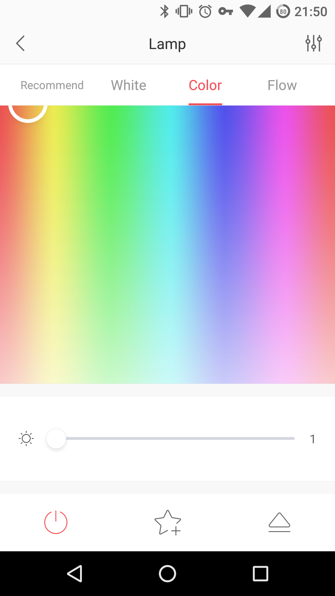
Check the most obvious differences on what green and blue are now and what they should look like (and actually have been looked in the earlier versions):
Do you see some kind of green at all? Previously the app was able to set nearly perfect deep natural true colors using these presets. Thus, there are no any constraints of the lamp itself, it’s all about the app.
So, developers, PLEASE - bring back the REAL COLORS PRESETS to the app.
Thanks!
@weiwei, @dingyichen, any comments on this please?
Have changed color preset in the picture you post, they are actually not pure red/green/blue… Will release soon.
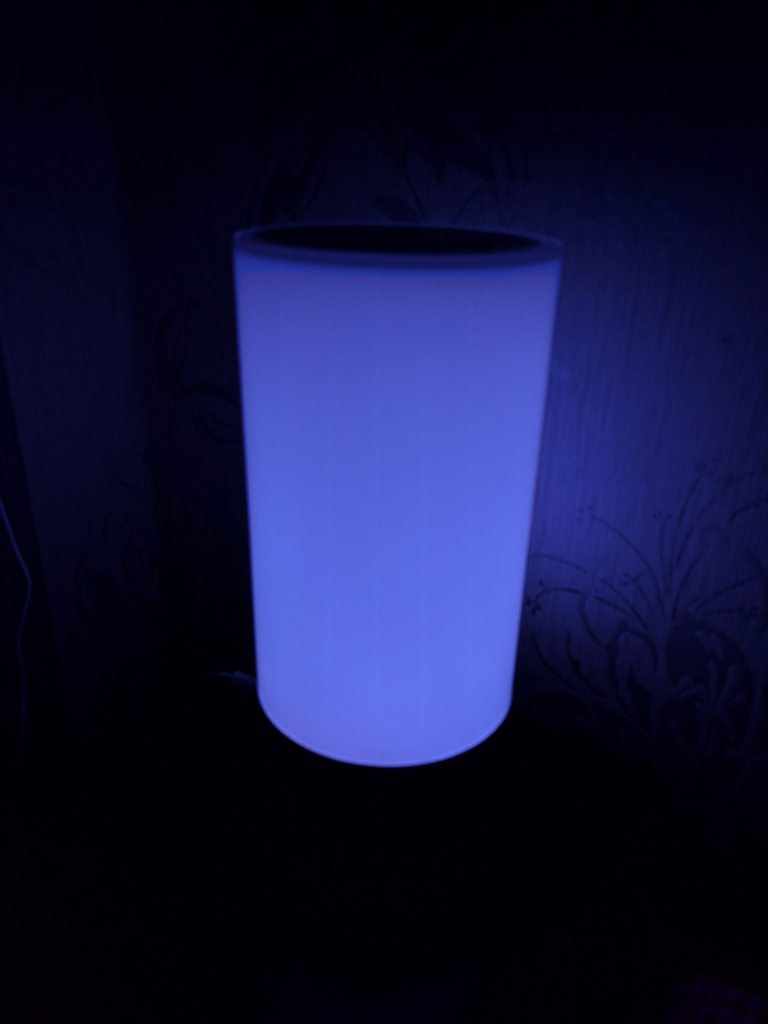
I noticed the same problem with purple. When selected it gives a very desaturated purple that appears almost as white.
Finally the colors of the presets give real deep colors they should to. Thanks for that.
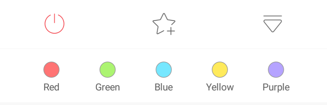
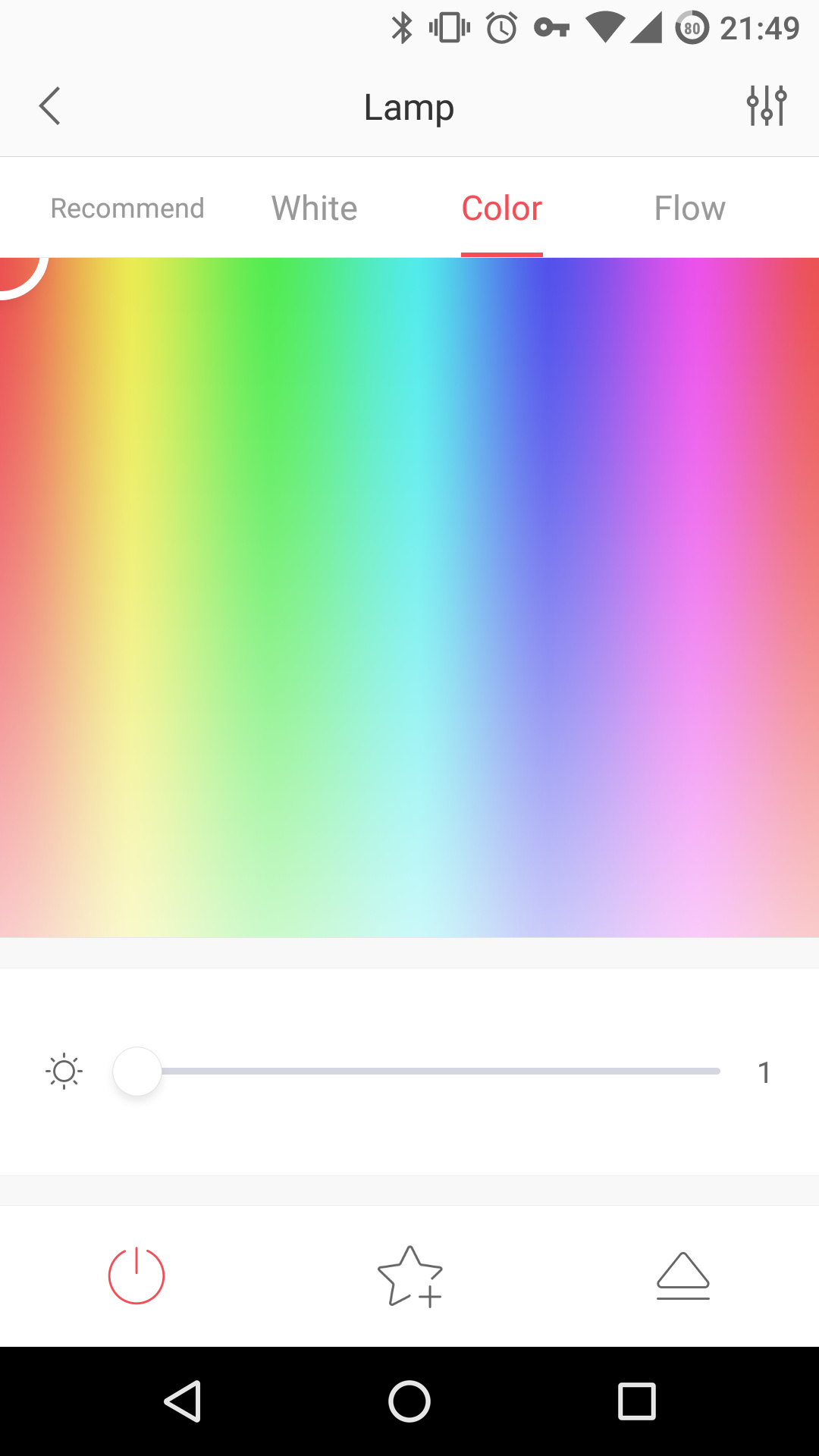
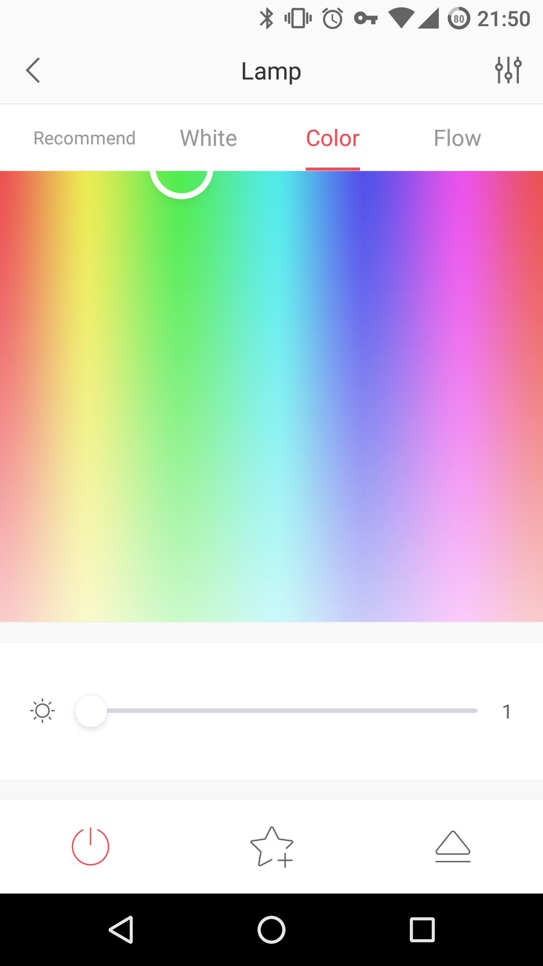
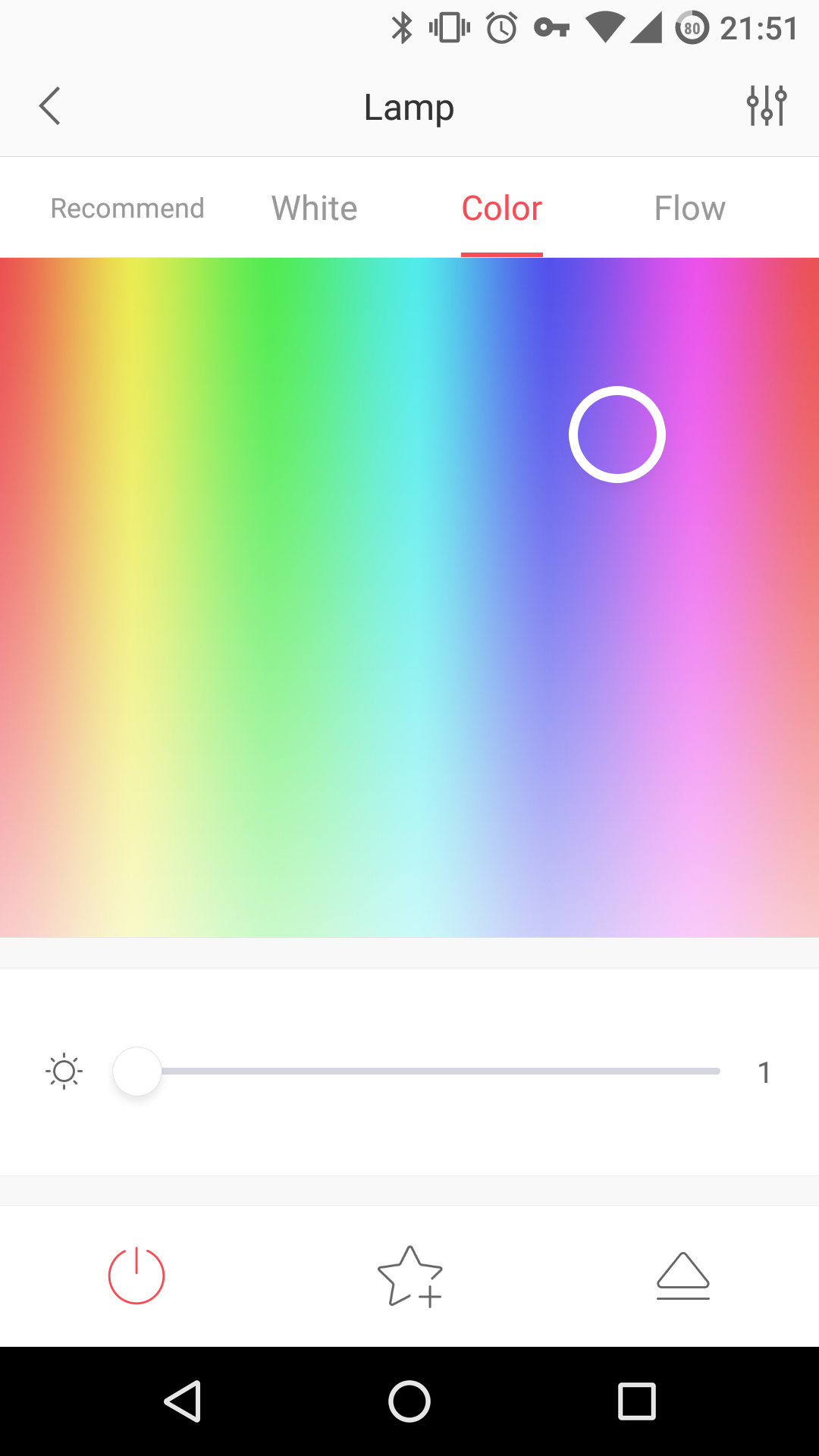
One thing though is that while all other presets set the most true color, purple is not. Please check the screenshots and note the color picker which represents chosen color preset:
Red Preset
Green Preset
Blue Preset
Yellow Preset
Purple Preset
@dingyichen is it intentional or should be corrected?
This is intentional, the color is given by vision designer. 
Well at least the vision designer guessed the other 4 colors.